This master-class has two objectives – to teach the design principles required to make plots that really have an impact on the reader, and to teach the practical skills required to create these plots within the R software package.
Instructor

Dr Mark Griffin is the Director of Insight Social Research & Statistics (https://www.insightrsa.com/industry-social-research). Insight focuses on research methodologies (including survey design and statistics) for public health, monitoring and evaluation for government and non-government organizations, and academic research. Insight has a secondary interest in providing IT services (as a Microsoft Business Partner).
Insight is based at the Gold Coast Health and Knowledge Precinct. The Precinct contains Griffith University Gold Coast, the Gold Coast University Hospital, the Gold Coast Private Hospital, and the Cohort and Lumina tech parks. Insight provides research, consulting, training, and IT support services for clients across the Precinct and for the broader international community.
To date he has presented over 100 two-day and 40 five-day workshops in statistics around Australia
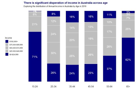
Consider the two plots below. In which plot can you easily see the pattern the author wants to convey within the plot, and what you should do as a result of the plot?”
Image
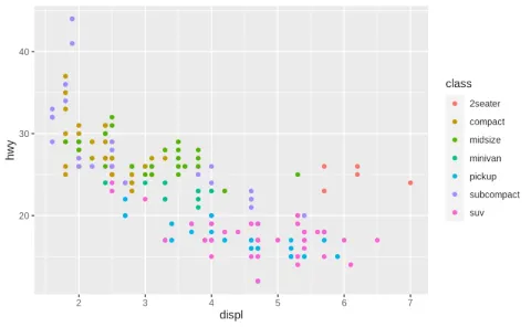
|
Image
|
Studies have shown that readers will only spend 3 to 8 seconds looking at each plot in a report before deciding whether to invest more time examining that plot or to move on to the next part of the report (Storytelling with Data, Cole). Hence as a data illustrator we need to design our plots very carefully so that within that very brief time window we have achieved the following aims:
• To highlight the key pattern that we want readers to take away from the plot, (we should not expect readers to be able to identify this pattern for themselves, instead we need to do everything we can to make this pattern obvious to them)
• To motivate the reader to a “Call to Action”, (if the reader simply learns something from a plot then that is of little value more than just entertaining the reader, instead we want to motivate the reader to perform a certain action or make a certain business decision as a result of that plot)
• Hopefully to motivate the reader to invest additional time and mental effort to discern what else they might be able to learn from that plot.
This workshop has two objectives – to teach the design principles required to make plots that really stand out for the reader, and to teach the practical skills required to create these plots within R. (While R is the favoured software of the instructor, participants can use other software during this workshop if they choose. The instructor may not be able to help you with other software.)
The workshop is relevant to any employee or consultant who is writing reports, producing PowerPoint slides, or creating dashboards that really need to stand out for their readers (such as senior managers and clients).
This course will be run over 3 days in three sessions per day:
- 10.00am - 11.30am - Session 1
- 12.30pm - 2.00pm - Session 2
- 3.00pm - 5.00pm - Session 3: exercises and consultation
Exercises will be provided and there will be opportunities for consultation with Mark in the afternoon sessions
This course is being held online via Zoom and run on Australian Eastern Standard Time (GMT +10)
Day 1
Session 1 - Fundamentals of Plot Design
- Types of plots
- What is a Key Message
- What is a Call to Action
- What is Instant Recognition
Session 2 - Fundamentals of Data Visualization in R
- How to produce different basic plots in R
- How to prepare your data for visualization
Day 2
Session 3 - Advanced Data Visualization in R
- Use of components - colour, size, location, reference lines and arrows, titles, text annotations, and footnotes
Session 4 - Advanced Plot Design
- How do I use every component in the best way possible to achieve Instant Recognition (for readers to be able to identify the Key Message within the data as quickly and easily as possible)
Day 3
Session 5 - Using ggplot in R for advanced functionality
- Introduction to ggplot, scales, axes and positioning
Session 6 - Introduction to R Shiny for dashboards
- Introduction to dashboards, design principles of effective dashboards, programming in R Shiny
Some basic familiarity with the R software package is expected prior to the workshop. The participant does not need to have any previous experience using R for data preparation or data visualization. No knowledge of statistics is required.
If students would like a head start in using R for data visualization they may choose to look at: https://r-graphics.org/
Details about R Shiny can be found at https://shiny.rstudio.com/
I've come away with key principles that will change the way I think about communicating key messages through graphs